
Good design starts with a specific problem: what does someone need to understand, trust, or do?
A visual refresh is not an end in itself. The more useful question is “What should this website make clearer or easier?”
A visitor needs to understand the business, decide whether to trust it, and find a sensible next step. Content, visual identity, structure, and interaction all contribute to those decisions. The right design depends on where the difficulty lies.
The projects below approached different problems. Their recorded outcomes provide context, not a promise that the same intervention will produce the same result elsewhere.
People adopt what they understand
A capable product can still be difficult to understand. The website needs to explain what it does before asking someone to invest time in using it.
Solara needed two connected experiences: a marketing site that explained the framework and documentation that helped developers work with it.
We treated them as separate products within one design system. A rebuilt information architecture and a quieter documentation interface made the material easier to navigate.
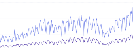
Over the six months that followed, monthly downloads rose 1,300%, reaching 170,000.
The design task was to reduce the effort of understanding the tool. The growth figure describes the period that followed; it does not isolate design from every other factor.
Identity should express a real distinction
Visual identity is most useful when it makes something true about the business easier to recognise. Looking different matters less than having a reason to look different.
HauerX Holdings is a venture builder, not an advisory, and its site was reading as the second thing. The founder’s phrase for what it needed to say was “receipts, not rhetoric.”
We skipped the SaaS conventions for a dark, terminal-styled interface, pairing a high-contrast serif for institutional weight with monospace detail for operational speed.
Against the previous site, qualified inbound deal flow rose 72%.
The visual direction came from HauerX’s operating model, not a general idea of what a premium website should look like. That distinction gave the design a coherent starting point.
Simplify the decision that matters
A purchase flow needs to suit the device and context in which people use it. A mobile audience deserves more than a compressed desktop layout.
Ruri Ohama is a productivity YouTuber who wanted to sell to her audience without producing what she calls “productivity guilt.” Her buyers are 25–35, mostly male, and almost all on a phone.
We designed for the thumb rather than shrinking the desktop layout, then tested the pricing: one option against three tiers.
The single option won, and checkout conversion rose 32% against the tiered version.
In this test, a simpler choice performed better. The lesson is to examine the decision in front of the customer and test the alternative, rather than assume that more options are always helpful.
Selected project outcomes
Project | Core Strategy | Recorded outcome |
Solara | Clearer marketing and documentation | +1300% Software Downloads |
HauerX | An identity rooted in the operating model | +72% Inbound Deal Flow |
Ruri Ohama | Mobile-First & Simplified Pricing | +32% Checkout Conversions |
SHIFT London | A portfolio for cultural and commercial work | +48% Total Traffic |
What the three have in common
Each brief called for a different response: explain the product, express the firm’s identity, or simplify the purchase. The common ground was not a visual style. It was a clear reason for the design decisions. Commercial results also depend on the product, audience, and wider business activity; a website is part of that picture.
If your website no longer reflects the business or helps people take the next step, that is a useful place to begin.
Let’s keep in touch.
Notes on design decisions, useful systems, and work in progress. Follow AethrDesign on LinkedIn and X.