No scroll sections found. Showing placeholder content.

Kylie Cosmetics E-commerce: A phone-first shopping experience, from product discovery to checkout.

Kylie Cosmetics E-commerce: A phone-first shopping experience, from product discovery to checkout.

Kylie Cosmetics E-commerce: A phone-first shopping experience, from product discovery to checkout.

A mobile storefront shaped around product discovery, detailed galleries, and a shorter path to purchase.

A mobile storefront shaped around product discovery, detailed galleries, and a shorter path to purchase.

Kylie Cosmetics was selling a phone-first audience through a desktop-shaped template. We rebuilt the store around the product feed: add to cart without leaving it, a shorter checkout, and galleries that hold the brand at phone size. Store revenue rose 130% over the previous site in three months.

Kylie Cosmetics was selling a phone-first audience through a desktop-shaped template. We rebuilt the store around the product feed: add to cart without leaving it, a shorter checkout, and galleries that hold the brand at phone size. Store revenue rose 130% over the previous site in three months.

Kylie Cosmetics was selling a phone-first audience through a desktop-shaped template. We rebuilt the store around the product feed: add to cart without leaving it, a shorter checkout, and galleries that hold the brand at phone size. Store revenue rose 130% over the previous site in three months.

Year

2022

Services

/

E-Commerce Solution

/

Web design

Category

/

E-commerce

Duration

12 weeks

Live Website ↗
Arca wordmark, dark navy

Impact

Impact

more store revenue than the old site, in 3 months

more store revenue than the old site, in 3 months

more store revenue than the old site, in 3 months

higher online-store conversion rate

higher online-store conversion rate

higher online-store conversion rate

more email-attributed revenue in the first 90 days

more email-attributed revenue in the first 90 days

more email-attributed revenue in the first 90 days

Arca Wealth homepage hero — the live site
Arca wordmark, off-white
Arca Wealth homepage hero — the live site
Arca wordmark, off-white

Kylie Cosmetics' storefront was a template. Rebuilt phone-first around the product feed, it returned 130% more revenue than the old site in three months.

Kylie Cosmetics' storefront was a template. Rebuilt phone-first around the product feed, it returned 130% more revenue than the old site in three months.

Website showcase video

Website showcase video

Background

Background

A beauty brand selling a phone-first audience through a desktop-shaped store.

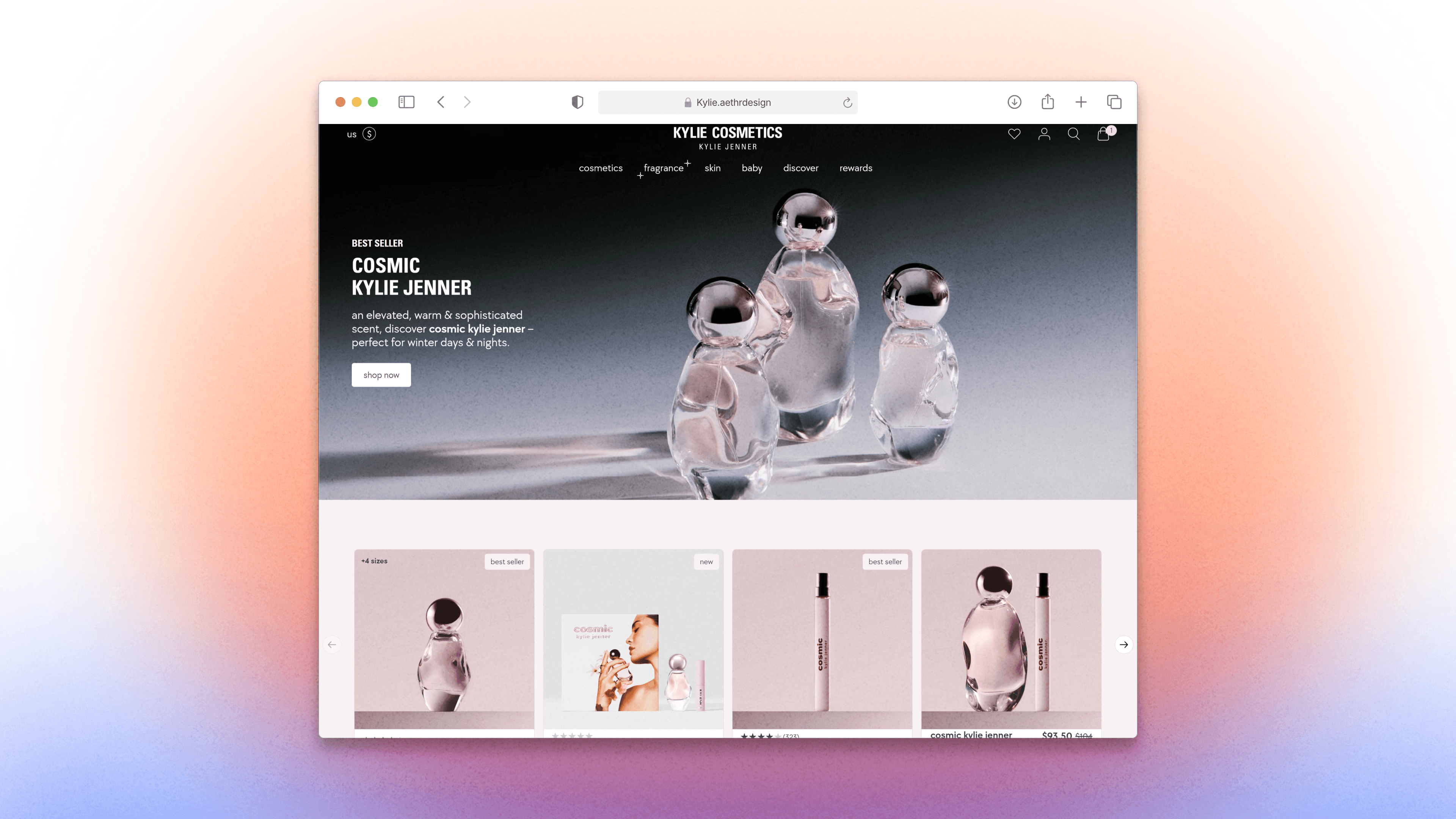
Kylie Cosmetics sells to an audience that shops on a phone, from a storefront that behaved like a shrunk-down desktop site. The brand's own imagery is the product, and the template gave it nowhere to run.
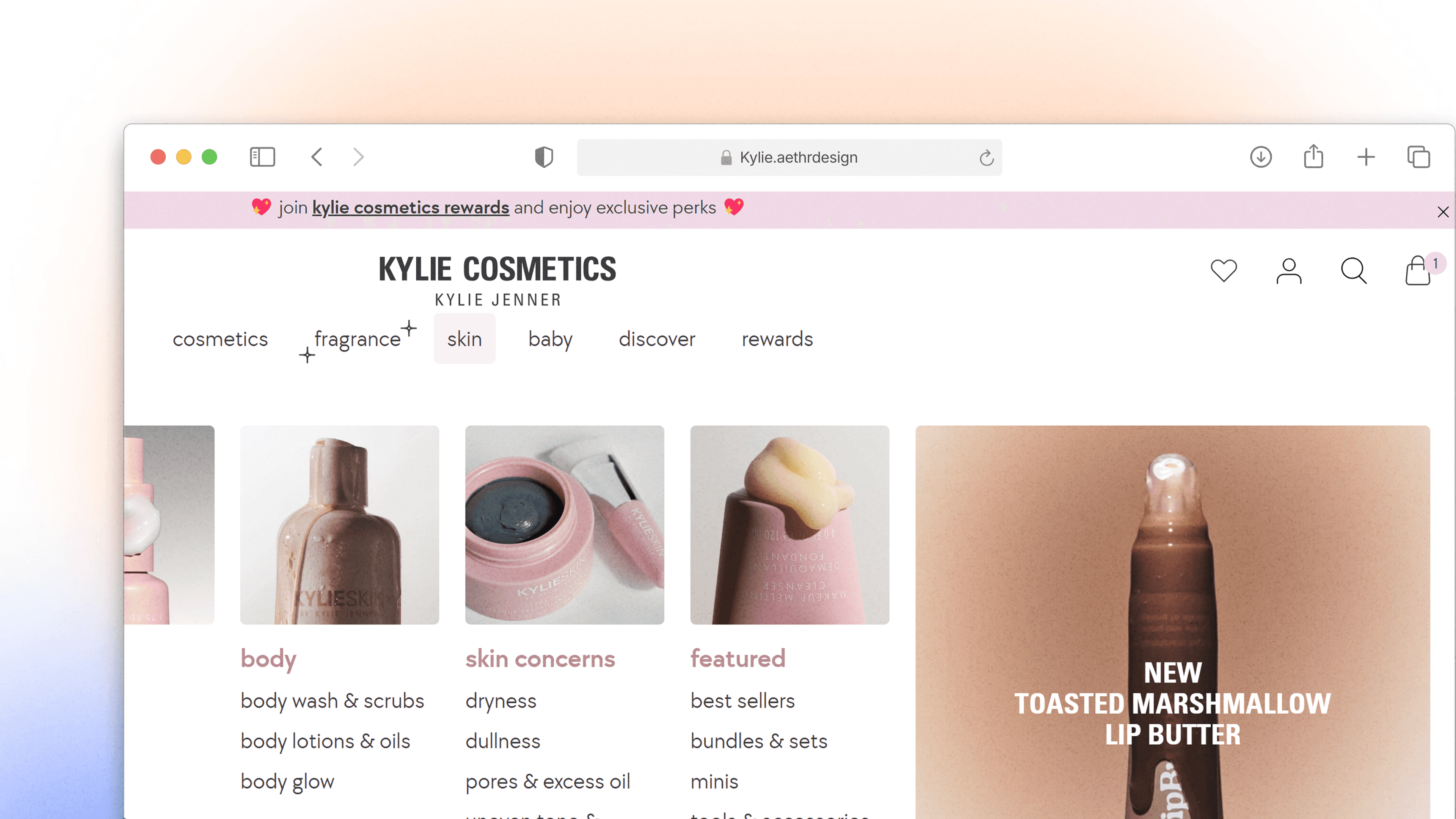
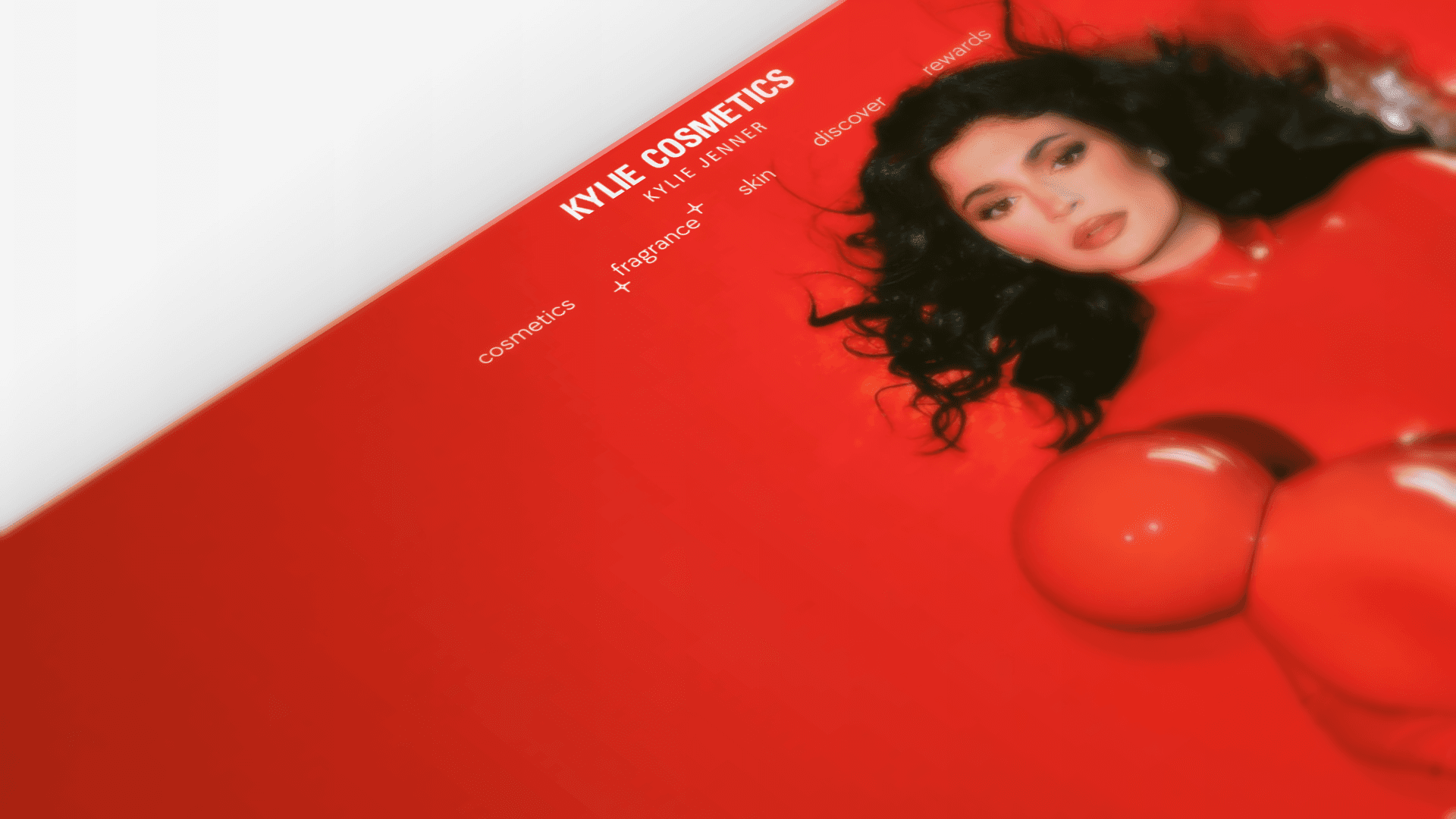
The campaign look at phone size. The old template was static and off-brand for an audience that shops on a phone. The page is now an app-like feed with full-bleed galleries.

The campaign look at phone size. The old template was static and off-brand for an audience that shops on a phone. The page is now an app-like feed with full-bleed galleries.

Arca's Growth Design Backlog in mid-August 2026, with the type audit and image-loading tickets in progress and two landing-page tickets shipped

Execution overview

Execution overview

Rebuilding the store around the product feed.

We designed for the phone first and let the imagery run full-bleed, then cut the number of steps between seeing a product and owning it. Customers add to the cart without leaving the feed, and the checkout keeps the brand's look to the last screen instead of handing off to a plain form.

Against the previous site, store revenue rose 130% in three months.
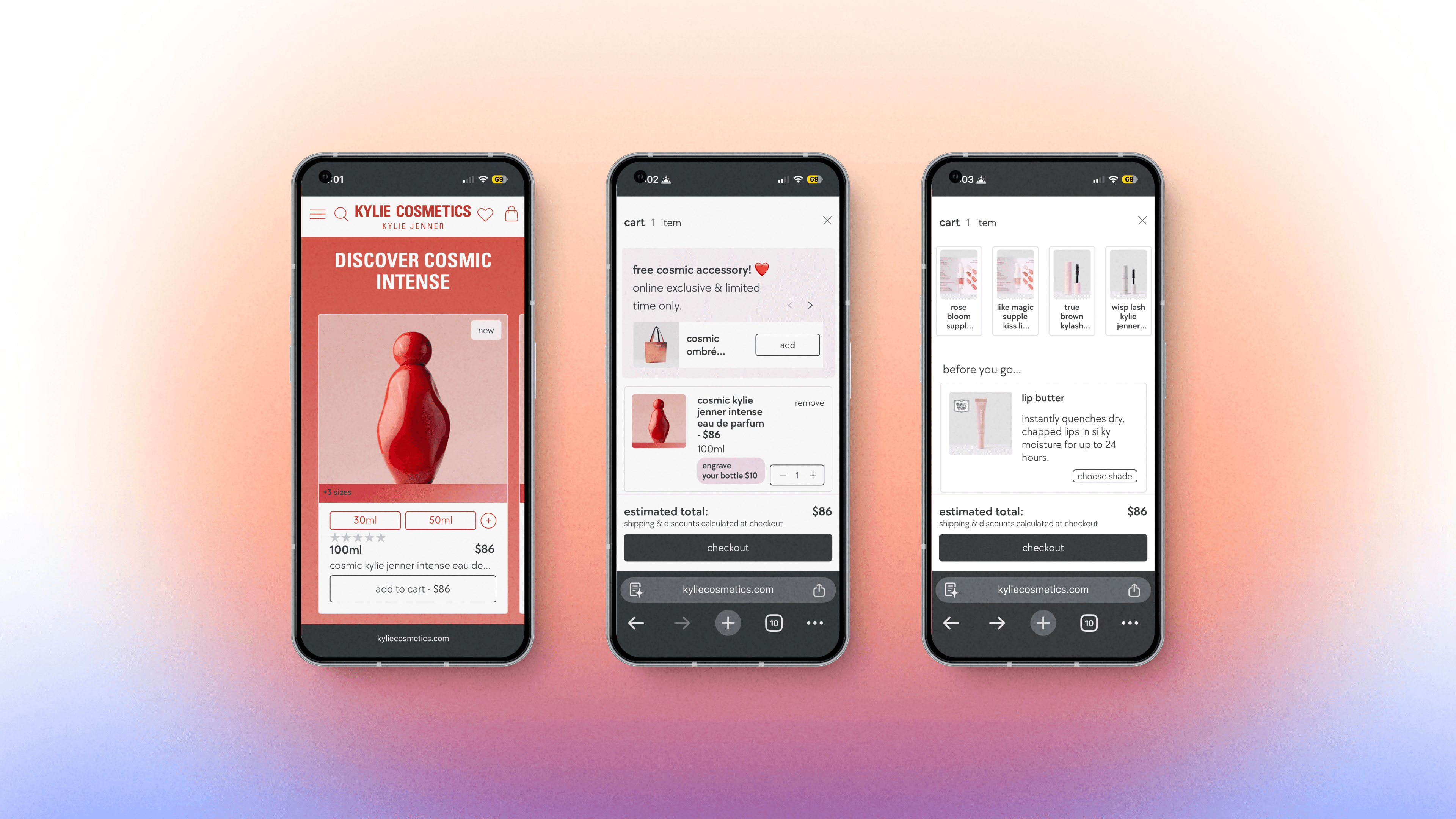
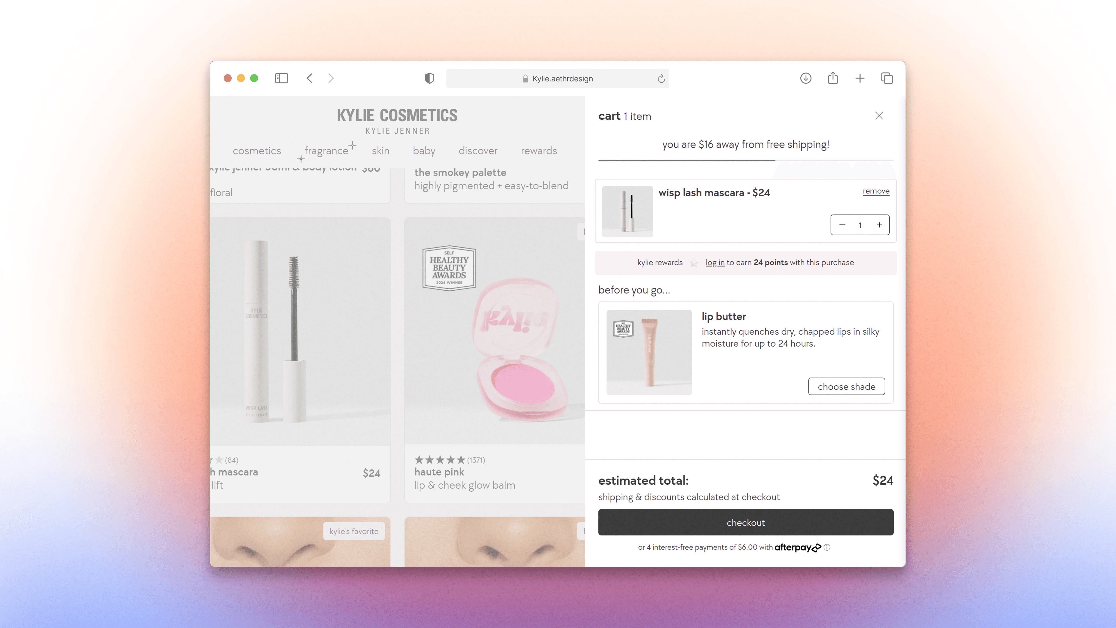
Add to cart without leaving the page. The old flow sent shoppers away from the feed for every item. A quick-add control now updates the cart in place.

Add to cart without leaving the page. The old flow sent shoppers away from the feed for every item. A quick-add control now updates the cart in place.

Arca Wealth hero on a cold load, side by side at the same viewport: before, the image tears into a flat navy fill with the headline already showing; after, the hero appears complete

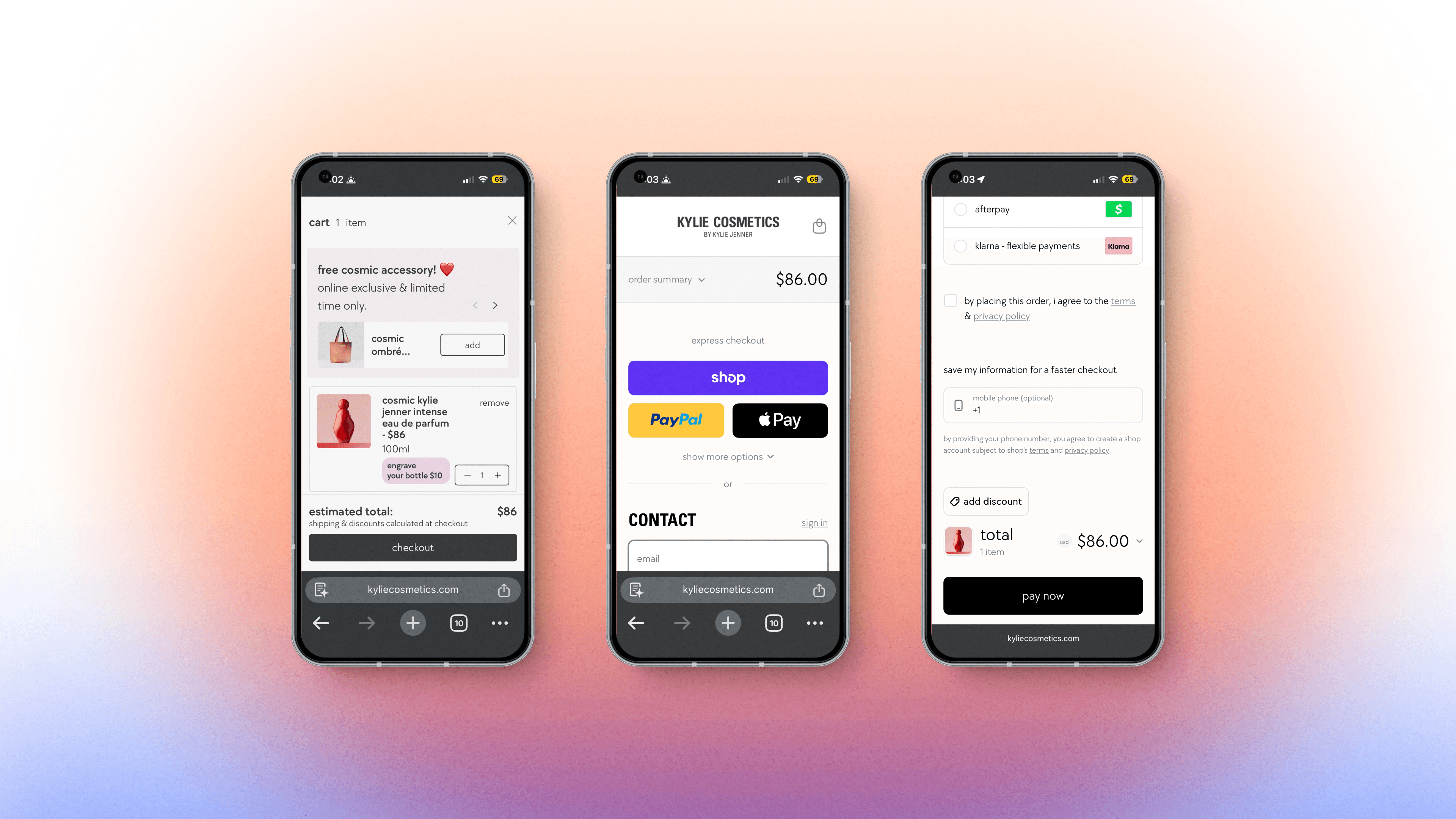
Checkout is where most stores lose people, usually to a form that looks like another company's. Ours has fewer fields and keeps the brand's look to the last screen.

Checkout is where most stores lose people, usually to a form that looks like another company's. Ours has fewer fields and keeps the brand's look to the last screen.

The 17 semantic text styles in Framer, applied to the live Arca homepage

Create a free website with Framer, the website builder loved by startups, designers and agencies.