Year
2026
Services
/
Web design
/
Web development
/
Branding & identity
/
Motion Design
Category
/
Portfolio
/
Professional Services
Duration
Live Website ↗


My client contact:
A student tutor and researcher outgrowing a template site built to sell lessons.
Maxematics started as a tutoring practice — a way for Max Schwarzkopf to teach math and science one-on-one — and its original Adobe-built site said exactly that: a services page for parents shopping for help.
The audience had moved on. Max was fielding more inquiries than he could take, doing molecular engineering lab work on protein folding, and heading into college applications, scholarship reviews, and research placements. The people opening the link were no longer parents comparing tutors. They were admissions readers, scholarship committees, engineering program reviewers, and internship evaluators — people who scan for evidence, not offers.
The site had to stop selling and start substantiating.


Designing for an evaluator’s reading journey.
The brief ran through our productized pipeline first: a structured spec, assembled into a working Next.js site. That set the floor. Max started on the $500 build, then moved to a bespoke engagement with the same content, hand-directed, plus a full brand revamp.
We designed around how an evaluator reads: identity, then proof, then breadth, then independent voices, then one easy way to get in touch.
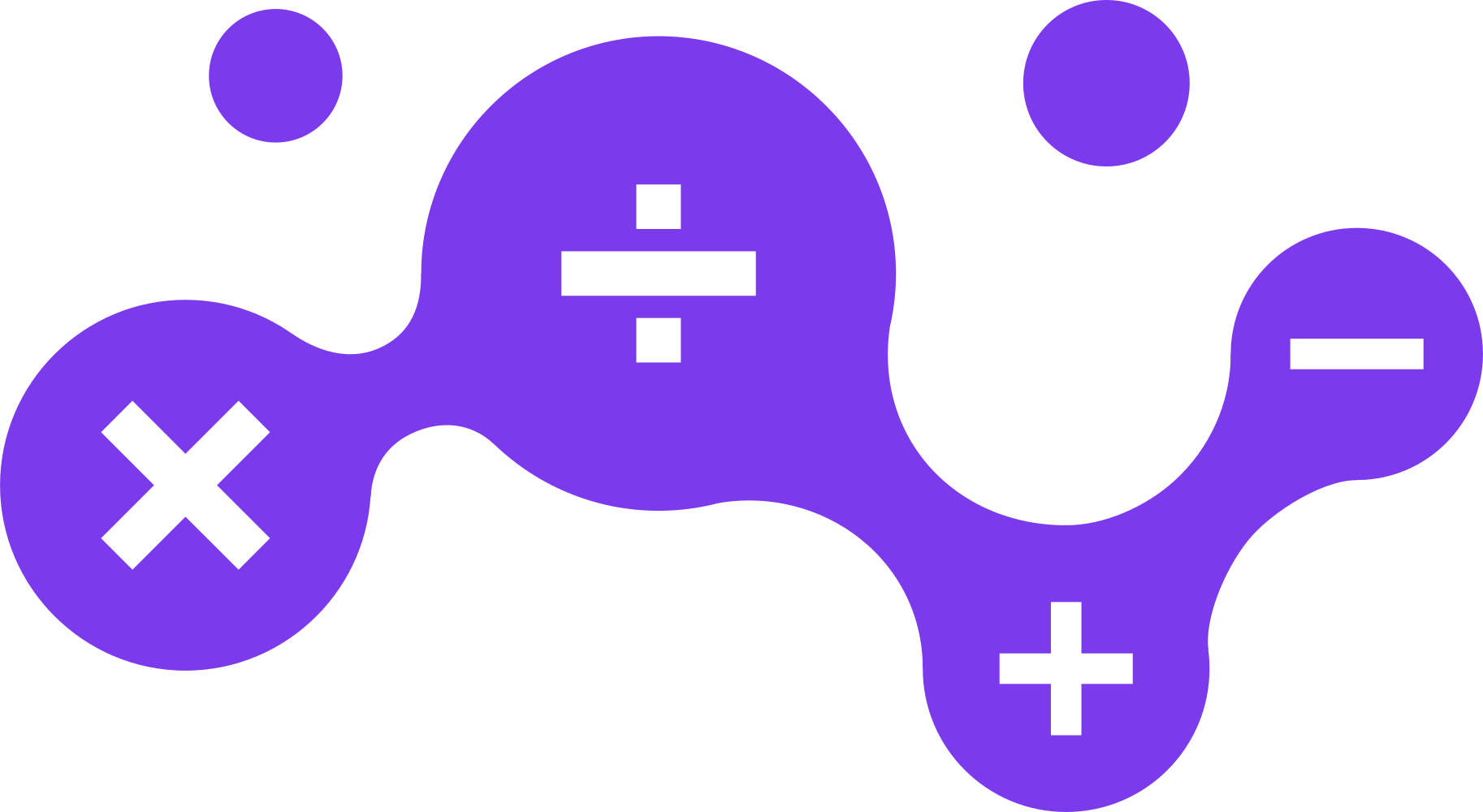
The identity was rebuilt with the site. The logotype swaps the x in max for a true multiplication sign in brand violet, at the same weight and x-height, chosen over nine alternatives.
Both marks were redrawn as vector artwork, and the system ships in two lockups and five colourways, including a single-ink violet for print. Usage rules are on the Maxematics identity page, and the decisions behind them in the process appendix.
The palette moved from saturated tutoring colours to violet on near-black, set in Sora and Instrument Sans. Animated gradients and mathematical glyphs give the site character without competing with the evidence.
Recorded PageSpeed Insights audits: 100 for accessibility, best practices and SEO, with performance at 99 on desktop and 91 on mobile. They are launch snapshots, not a substitute for accessibility testing.

Cynthia Schwarzkopf
Max's mother, Maxematics
Next projects.
(2021-26™)