Year
2026
Services
/
Web design
/
Web development
/
Branding & identity
Category
/
Portfolio
/
Corporate
Duration
8 weeks
Live Website ↗
A VC fund raising $50M without an existing brand, website, or newsletter system.
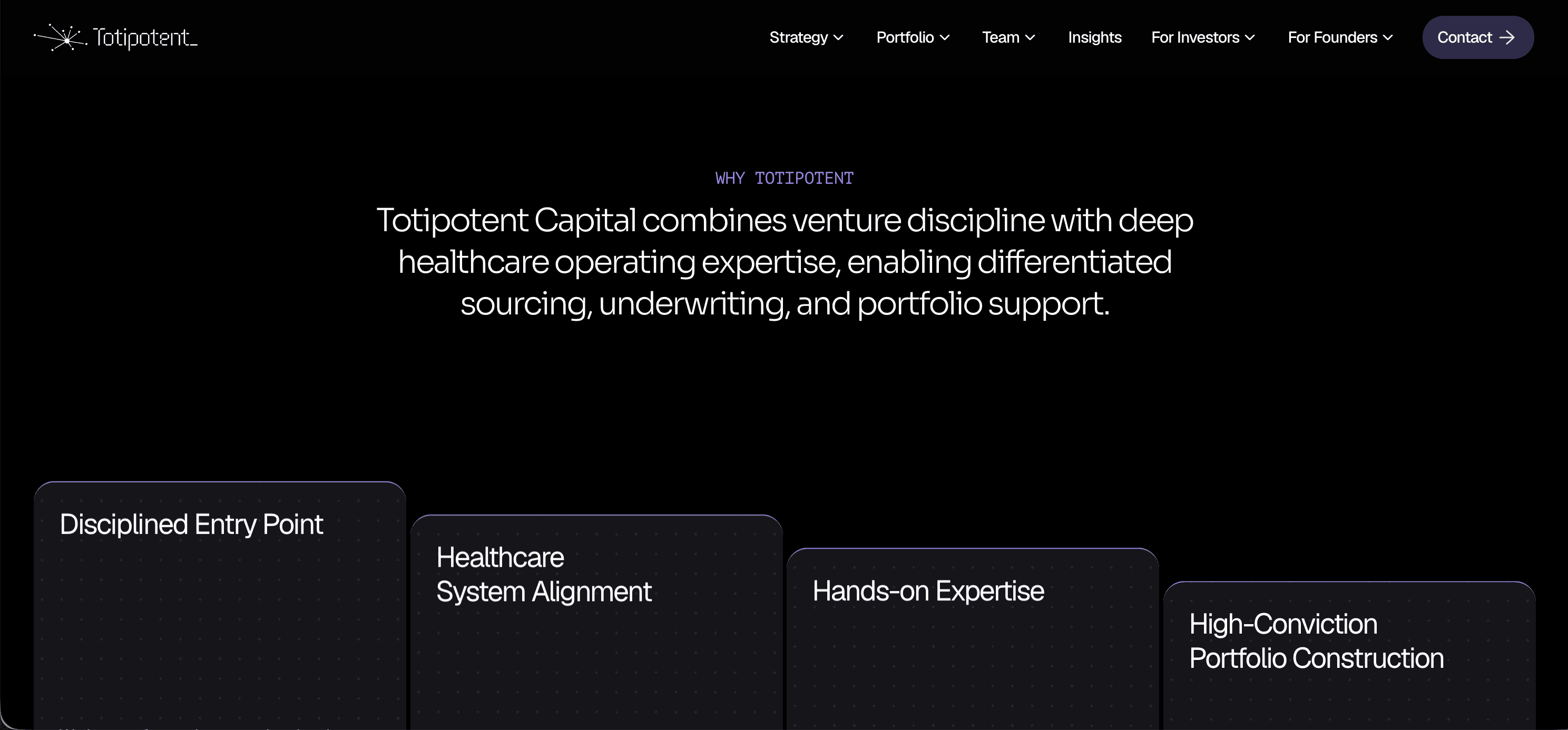
Totipotent Capital was raising a $50M Fund II targeting Series A/B healthcare and health-tech companies, but had no established brand identity, website, or investor communications system to match the scale of the raise. Rather than patching together separate vendors for logo, site, and newsletter, we delivered all three as one unified engagement — a single point of ownership across brand identity, web design, web development, and newsletter design, built to project institutional credibility from day one.


Building the brand first, then an editorial system that carries it end to end.
The identity came first, because everything else hangs off it. The logomark is a single hub throwing eight spokes to eight free-standing nodes — no two spokes sharing an angle or a length, because no two portfolio companies scale on the same trajectory. The hub is the firm; each node a company, reached and supported but standing on its own. The logotype is custom, broken lettering that mimics cell division, and the accent is a single Indigo Violet (hsl(256, 60%, 62%) / #5F4EB5) chosen as a nod to the scientific stains that make cellular structure visible — deliberately avoiding both generic fintech blue and web3 magenta. The mark ships as real vector artwork in horizontal lockup, wordmark and logomark forms, across full-colour, reversed and single-ink colourways, with a favicon set and a written usage sheet. The full identity system, including the design rationale behind every decision, is documented in the Totipotent Capital brand identity masterbook.
From that foundation we synthesized an original visual language built for institutional trust — an editorial, minimal layout with elevated typography, full-bleed imagery, and smooth parallax-driven scroll motion. Sora anchors display type, Geist carries body copy, and the Indigo Violet accent is introduced sparingly against near-black to keep the tone premium. Curated footage across labs, research, and provider environments replaced generic stock photography to keep it sector-specific. The whole system — navigation, layout, and content structure — stays visually consistent even as content is heavily modified, and it all shipped as one package alongside the brand identity and the newsletter template.


Next projects.
(2021-26™)